The Digital Menu as a Revenue-Growth Tool: Lessons from EU Restaurants
Moving from static physical menus to purpose-built digital menus — accessible by QR code — is one of the few genuinely high-return, low-cost tools available to restaurant operators right now.
Every restaurateur who has had to reprint a menu knows that particular kind of pain. You sign off on the design on Tuesday, send it to the printer on Wednesday, and on Friday a wholesale supplier raises ingredient prices by eight percent. The new menus are already laminated. The price on the page no longer matches the price in the kitchen, and the difference comes straight out of your margin.
Multiply that inconvenience across a year of eurozone inflation, volatile supply chains, and rising labor costs, and you begin to understand why static paper menus are not merely inconvenient but a structural liability. The problem isn't that restaurateurs price badly. The problem is that they're locked into a pricing architecture designed for an era of stable costs and predictable customer behavior — and that era is over.
This is a practical look at what the research, the data, and the operational experience of European hospitality venues actually show: moving from static physical menus to purpose-built digital menus — accessible by QR code on a mobile device — is one of the few genuinely high-return, low-cost tools available to restaurant operators right now. And, more importantly, it is the structure, photography, and sequencing of that menu that determine whether it performs or merely exists.
The Math of the Modern Check: Why Static Menus Lose in the Eurozone
The Financial Reality of Eurozone Inflation and Fixed Pricing
The European Central Bank's successive rate-hike cycles between 2022 and 2024 produced eurozone food-inflation levels not seen since the 1980s. Hospitality operators, who typically work on pre-tax margins of three to nine percent, were caught in a vice: costs climbed every month, while printed menus locked prices in place for entire quarters.
The economics of printing physical menus are rarely examined in detail — but they should be. A mid-sized restaurant printing laminated menus in runs of fifty to a hundred copies pays not only for the print itself — typically €150 to €400 per run, depending on format and finish — but also carries an opportunity cost for every week those menus stay in circulation after costs have changed. If your wild salmon dish ran a 68% gross margin in January and the supplier adjusted the wholesale price in March, you don't simply lose margin on the salmon. Every time that menu hits the table, you broadcast a price-to-value ratio that no longer reflects reality.
Digital menus break that cycle entirely. A price change that once required a redesign, a print shop, delivery, and physical replacement can now be made in under two minutes from a browser window. That operational flexibility is worth more than it first appears.
| Metric | Static printed menu | QR digital menu |
|---|---|---|
| Average cost per print run | €150–€400 | €0 |
| Price-update frequency | Quarterly or less often | Real time |
| Time to implement a price change | 3–10 days | Under 5 minutes |
| Response to a supplier cost spike | Delayed (absorb or reprint) | Instant micro-adjustment |
| Consistency of upsell prompts | Depends on staff | Set by menu architecture and item placement |
| Cost of updating photography | Full reprint required | Upload and publish |
Defining Average Order Value (AOV) and Margin per Table
Before discussing how to grow revenue through menu engineering, it's worth establishing what exactly you're trying to optimize — because AOV and margin per table are related but not identical, and conflating them leads to poor decisions.
Average order value (AOV) is the average spend per order across all guests and order types. It's the number most digital-menu platforms will surface for you, and it's useful for tracking the overall trend in customer spending. Yet a restaurant with a high AOV built on low-margin items can still deliver a thin margin per table.
Margin per table accounts for the real gross profit from each seating, factoring in cost of goods, service time, and overhead. This is the number that ultimately determines whether a restaurant is profitable.
Menu engineering in its strictest form is the discipline of understanding the interplay between these two metrics and structuring the menu to steer customer attention toward items that score well on both: high popularity and high margin. Such items are conventionally described, in the menu-engineering vocabulary introduced by researchers Michael Kasavana and Donald Smith of Michigan State University in 1982, as "Stars" — and the entire architecture of a well-designed digital menu is built around bringing them to the fore.
15–23%
Typical AOV uplift when moving from paper to structured digital menus with photos and portion choices
Kimes 2008; Tan & Netessine 2017
€150–€400
Average cost of a single physical-menu print run
Industry data, EU average
< 5 min
Time needed to push a live price change on a digital menu platform
Operational experience of EU operators
3–9%
Pre-tax margin range for most hospitality venues in Europe
ECB 2024; Eurostat 2024
The Digital Menu as a Tool for Informed Choice
The information barrier between guest and dish
A server physically cannot explain the composition of every dish, show a photo, and answer allergen questions at every table at once. A digital menu does this without adding to the staff's workload. The main advantage isn't sales automation — it's the removal of that barrier.
Photos, filters, and search: confidence in choosing
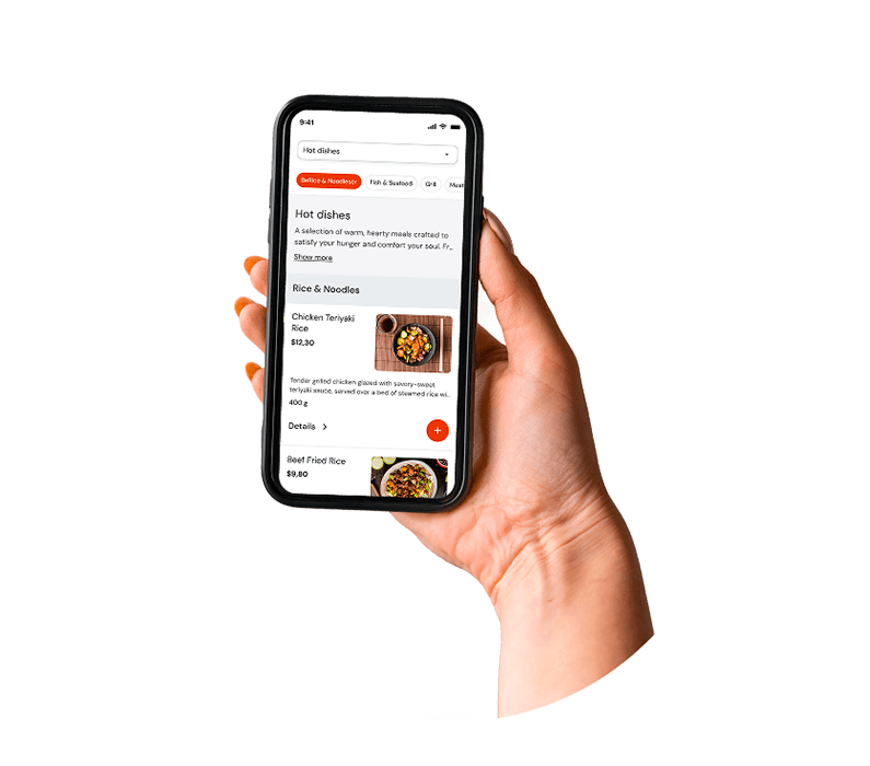
A guest opens the menu via QR code and instantly has access to dish photos, category filters, and search. Instead of flipping through pages looking for the right item, they find it in seconds.
A language switcher for an international audience
If a venue serves tourists, business guests, or a diaspora community, language accessibility directly affects confidence in choosing and average check size. A guest who understands the menu in their native language orders more, and more confidently.
Portion choice tied to price
The guest sees the difference between 100g and 200g with the corresponding prices and decides on their own, without an awkward back-and-forth through the server. This shortens ordering time and reduces errors when the order is taken.
The server is freed for what matters
The server remains the central figure in service — but is no longer a living menu reference. Their attention shifts to where it truly matters: the quality of presentation, the atmosphere, and handling special requests.
Anatomy of a High-Converting QR Menu
Cognitive Load and Menu-Scanning Patterns on Mobile Devices
A QR menu is not a PDF of your printed menu. That distinction matters more than most hospitality venues realize when they first make the switch. A PDF uploaded behind a QR code — a common first-generation implementation — reproduces every structural problem of a physical menu (information density, non-interactive presentation, no portion choice or dish detail) while adding the friction of navigating by pinch-and-zoom on a mobile screen. In most implementations it's worse than the paper original.
A purpose-built digital menu, by contrast, is designed around the specific cognitive patterns of mobile use. Research into mobile reading behavior consistently shows an F-shaped or inverted-L scanning pattern: users engage heavily with the top of the screen, scan the first category horizontally, then move vertically down the left edge of the content, engaging less with items in the bottom-right corner of the viewport. In a mobile menu this means the top of the screen — especially the first two or three items visible without scrolling — is premium real estate, and its occupants should be chosen deliberately.
Category architecture matters just as much. A menu that presents a flat, alphabetical list of forty dishes creates what cognitive scientists call "choice overload" — a state in which the volume of options degrades decision-making rather than aiding it.
Placing the "Stars": Maximizing Visibility for High-Margin Items
The concept of positional priority — the finding that items placed first in a list receive a disproportionate share of attention and selection — is well documented in consumer psychology and applies directly to digital menu design. On a physical menu, operators have traditionally used visual cues (boxes, icons, larger type) to highlight recommended items. Digital menus expand that toolkit considerably — up to and including pinning a recommended dish, margin indicators in the back office, and adaptive page layout.
Within each category, the highest-margin items should occupy the first and second positions. The third position is sometimes called the "anchor" — a higher-priced item that makes the first two look more attractive by comparison — a pricing-psychology technique known as price decoy. Below the first visible screen (below the initial above-the-fold zone), conversions for items drop noticeably.
Visual "recommended dish" banners — a prominent card at the top of the menu's home screen that highlights a specific dish — should be positioned with current stock levels, margin priorities, and seasonal availability in mind.
The Impact of Quality Food Photography on Conversion Rates
The research on food photography in digital menus is consistent and unambiguous: quality images raise the conversion rate of the items they accompany, with the strongest effect on high-margin items that guests may be less familiar with.
The operational takeaway is that investment in photography should be allocated strategically, not uniformly. Photographing every item on a large menu is expensive and, on mobile interfaces, can cause visual fatigue. The more effective approach is to photograph your "Stars" and "Puzzles": high-margin items that lag in popularity, often because guests don't know what they look like.
On a mobile device, images should follow a thumbnail-first format: a clean, appetizing thumbnail in the list that expands into a full descriptive card on tap.
"Photography shouldn't make every dish look stunning. It should make the high-margin dish feel more real, more tangible, and more desirable than a description alone could achieve."
UX heatmap — the natural scroll path on a mobile device:
Zone A (top of screen, full width)
Highest engagement — the category navigation bar and the first visible item. The best spot for the recommended-dish banner and the first "Star."
Zone B (top items in the selected category)
Strong engagement — this is exactly where the eye moves after a category is chosen. Place the second and third "Stars" here.
Zone C (middle of the list, the scroll zone)
Moderate engagement. Standard items, sides, entry-level options.
Zone D (end of the list)
Low engagement without deliberate scrolling — avoid placing priority items here without additional visual emphasis.
Cushioning Supply-Chain Volatility with Dynamic Pricing
Micro-Adjustments: Changing Prices Without Alienating Regulars
The argument against dynamic pricing in restaurants is usually framed as an argument about trust: if guests sense that prices change unpredictably, they lose confidence in the venue. That's a natural concern, but it conflates two very different pricing behaviors. Surge pricing — raising prices during peak demand periods — is the trust-eroding version. Defensive margin micro-adjustment — updating a dish price by €0.50–€1.50 in response to a change in the wholesale price of an ingredient — is something else, and most guests, when they encounter it, neither notice nor object.
The reason they don't notice is that digital menus remove the reference point. When a price is laminated onto a card that has sat on the table for months, a €1 increase is visible. When the price exists only on a screen that updates between visits, the guest's point of comparison is their memory of the last check.
The practical discipline is to make changes proportionally and gradually. A supplier raises the cost of chicken breast by 12%. Rather than absorbing the full margin hit until the next menu cycle, you raise the price of your chicken dishes by €0.75 — an amount that protects roughly 60% of the lost margin, rounds to a psychologically comfortable price point, and is unlikely to be perceived as a meaningful change by most guests. You make that change in the admin panel in under five minutes.
Frequently Asked Questions
Research data and industry reviews of EU operators consistently point to AOV growth in the 15–23% range when moving from static paper menus to structured digital menus. The primary mechanism isn't automation but the removal of the information barrier: the guest sees a photo, a detailed description, and the available portion options (for example, 100g or 200g) — and makes a more confident decision without checking with the server. A guest who understands what they're ordering is more likely to choose a larger portion or add an item they would simply have overlooked on a paper menu.
On both mobile and desktop views, quality food photography raises conversion for high-margin dishes when applied selectively. The optimal layout uses a scrollable list format with thumbnail previews that expand into rich descriptive cards on tap. The strategic recommendation is to photograph your "Stars" and underperforming high-margin items first.
No. The server remains the central figure in service — a digital menu only changes their role. Instead of answering "what is this?" or translating dish names for a foreign guest, the server focuses on presentation, atmosphere, and special requests. The guest browses the menu in their own language, builds their order, and calls the server over with a choice already made. When needed, the server can switch the menu to the original language to confirm the order accurately, with no mistakes.
The EU's GDPR regulation requires explicit, informed user consent before any guest data can be used for marketing communications. If your digital menu collects contact details or is connected to a CRM, you are required to obtain explicit consent for each type of use.
The number of languages is up to the venue's owner — they add the translations themselves through the admin panel. There's no technical limit: a restaurant in a tourist area can add English, Spanish, French, Japanese — any language it considers relevant to its audience. The guest sees the menu in the language they chose on entry. At any point the server can switch the interface to the original language to make sure dish names match what's in the kitchen.
The Systemic Picture: From Individual Tactics to Architecture
Each of the components covered in this article — positional menu engineering, price-linked portion choices, dynamic pricing, quality photography, and language accessibility — delivers a measurable benefit on its own. But the substantial gains operators report come from implementing them as an integrated system, where each element reinforces the others.
A guest who scans the QR code on arrival lands in a mobile app where the first thing they see is a quality image of your recommended, highest-margin item, placed at the top of the home screen.
The economics aren't complicated. The question facing operators in Europe isn't whether digital menu engineering works. The evidence for that is comprehensive and consistent. The question is whether the transition is carried out thoughtfully — with the right dish positioning, strategic investment in photography, correctly configured portion options, language accessibility, and a pricing strategy that uses the flexibility of digital menus to absorb eurozone price pressures — or whether it's treated as a simple QR-code switch and left untuned.
Sources: Kasavana & Smith (1982) — Menu Engineering · Hou, Yang & Sun (2017) — Do pictures help? · Tan & Netessine (2017) — Tabletop Technology Impact · Lee & Kim (2020) — Electronic menu presentation · Kimes (2008) — Technology in restaurant revenue · ECB (2024) — Inflation in the Euro Area · European Commission — GDPR 2016/679 · Iyengar & Lepper (2000) — When Choice is Demotivating · Nielsen Norman Group (2020) — F-Shaped Pattern · Eurostat (2024) — HICP food inflation