
QR Menu Analytics: The Metrics That Actually Matter for EU Restaurants
A QR menu turned the oldest tool in hospitality into a source of QR menu analytics — but only a handful of its numbers deserve an owner's attention. Learn which metrics to track, what a digital menu can never show you without a POS, and how to stay GDPR-compliant while doing it.
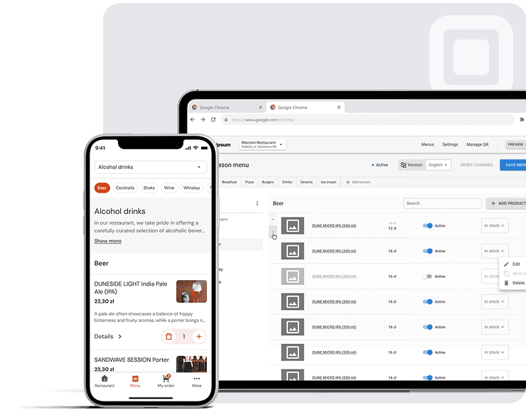
For decades, the printed menu was a black box. A guest picked it up, read part of it, ordered — and set it back down. Nobody ever knew which dish they almost chose, how long they hesitated over the wine list, or whether they walked out entirely because there was no vegetarian option. The menu did its job and disappeared.
That black box cracked open the moment restaurants across Europe started printing a small square code on table tents instead of a laminated card. What began as a temporary pandemic-era fix quietly turned into something else: the first genuinely measurable version of hospitality's oldest tool.
The problem is that most owners never use it. Ask an operator in Lisbon, Ljubljana or Lyon what their QR menu tells them, and you'll usually get a shrug — or a number from a dashboard nobody has really opened: “we get about 200 scans a week.”
This isn't a story about restaurants needing more data. It's a story about which parts of that data deserve an owner's attention, which parts are just noise dressed up as insight, and what a digital menu will never show you no matter how many charts the dashboard draws.
What a QR Menu Actually Measures — and What It Can't See
Start with an honest boundary. A QR menu sees everything a guest does before they speak to a server: when they opened the menu, in which language, which dishes they expanded, what they favourited, what they put in the cart, whether they came back two weeks later. After that, the menu goes blind. What actually left the kitchen, what the guest ordered out loud, how much they tipped — that's POS territory, not menu territory.
In a browse-and-call-the-waiter model, with no till integration and no payment processing, menu analytics measure intent, not revenue. That's a narrower field than some vendors promise — but every number in it means exactly what it says, with no additional assumptions required.
| Metric | What it measures | Why it matters |
|---|---|---|
| QR scans | How many guests opened the menu, by day and hour | Traffic, peak hours, how well the code is placed |
| Dish views | Which items a guest expanded to read the description | Real interest, rather than a manager's guesswork |
| Favourites | What a guest marked as wanted | The strongest intent signal in the menu |
| Average cart value | Total value of items in carts, divided by guests | The closest thing to money without a till |
| Returning guests | How many people opened the menu again | Loyalty a printed menu never registered |
| First-open language | Which language a guest started in | Who your audience is, and whether translation pays |
| Social link clicks | How many guests tapped through to Instagram or Facebook | The only measurable channel leading out of the menu |
What isn't here — and won't be without a till: total revenue, real average spend, a views-to-orders ratio, and any answer to why a guest chose one dish over another. If a vendor promises order conversion without POS integration, it's worth asking what exactly they're calling an order.
A view is not an order, and a cart is not revenue. Confusing intent with fact is the most common mistake restaurants make when they open a QR menu analytics dashboard for the first time.
Metric #1: Dish Views Against Your Own Expectations
If an owner has ten minutes a week, the most useful way to spend them is on the dish list sorted by views — compared against the list you expected to see.
The logic becomes obvious the moment you see it. An item you consider a flagship that sits in the bottom third by views has a visibility problem: it's buried too deep in its section, the name is weak, or there's no photo. That's a fifteen-minute fix in the menu editor. Far more interesting is the dish with high views that doesn't get favourited and rarely reaches the cart: guests are actively interested, they read the description, and then something makes them back away.
This is where QR menu analytics earn their keep. They don't show you what sells — they show you where the guest stops.
Scenario — an illustrative example
Picture a seaside restaurant in a tourist town. The whole roasted fish gets nearly twice the views of any other item and is favourited regularly — but almost never reaches a cart. The owner opens the dish page through a guest's eyes and finds the reason: the price is listed per kilo, no weight range is given, and the description doesn't say how many people a portion serves. The guest reads, can't work out what it will cost, and picks something predictable instead. After adding a weight range and an approximate price per portion, the gap between views and cart adds closes within two weeks.
That's a copy fix, not a kitchen fix. Without view data it would have been invisible: by revenue alone, the dish would simply look average.
Photos: The Effect Is Real, the Numbers Need Caution
One source reports that adding photos lifts menu conversion by roughly 25%; another puts the increase in total orders above 35%. Both draw on delivery-app research rather than the European dine-in model, where the guest is already seated. So the honest formulation is this:
Photos consistently improve behavioural metrics, probably by a double-digit percentage, but treat the exact figures as indicative and verify them on your own menu.
25–30%
Photo effect
Delivery-sector data; the only academically measured estimate is around 6.5% per item (Cornell, 2014).
200+
A/B test threshold: views per variant
A practical minimum, not a statistically derived threshold.
2–4 weeks
Recommended test duration
Long enough to cover both weekdays and weekends.
Three Context Metrics: Money, Loyalty, Language
Average cart value is the closest a menu gets to money without a till. The calculation is simple: the total value of all items added to carts over a period, divided by the number of guests. The absolute figure matters less than the trend — if it rises for a third consecutive week after a menu restructure, the change is working. An hourly filter reveals something else: lunch carts and dinner carts follow different rules in most venues, and the menu is often worth optimising separately for each.
Returning guests is a metric printed menus never had. It won't tell you whether a person physically came back; it tells you the menu was opened again from the same device. For a city venue with a local following, a rising number here is a decent proxy for loyalty. For a restaurant on a tourist seafront it will naturally stay low — and that's fine.
First-open language is one of the most valuable signals in tourist regions. Record the first language chosen, specifically: it reflects the guest rather than their later experiments with the switcher. If a noticeable share of guests starts in a language you don't offer as a primary one, that's direct evidence translation will pay for itself. One important caveat: interface language is not country of origin. A German in Spain will often open the English version.
Menu Engineering: Popularity from the Data, Margin from You
Sorting dishes into stars, plowhorses, puzzles and dogs has been around for decades, and it needs two axes: popularity and profitability. A menu dashboard supplies the first — and can't supply the second, because it doesn't know your food cost. But you do. Put views and cart adds in a table next to your own margins and the matrix assembles itself in half an hour, once a quarter.
| Category | Popularity (menu data) | Profitability (your numbers) | Action |
|---|---|---|---|
| Stars | High | High | Protect, don't touch |
| Plowhorses | High | Low | Adjust price or portion slightly |
| Puzzles | Low | High | Improve visibility: photo, copy, position |
| Dogs | Low | Low | Remove or replace |
A/B Testing Menu Changes
Five steps to a test that actually tells you something
- Pick a dish with a gap between views and cart adds.
- Change one thing: the description, the position within its section, or the photo.
- Run it for 2–4 weeks using the date-range filter.
- Compare before and after (you need 200+ views per variant).
- If the numbers improve, keep the change; if not, test a different variable.
GDPR and ePrivacy: What This Means for an EU Restaurant
Menu analytics don't collect names, phone numbers or payment details. But calling them “completely anonymous” would be inaccurate, and that inaccuracy is expensive.
Two of the metrics above — returning guests and first-open language — technically require storing a small identifier on the guest's device. The moment you write to or read from a user's device is governed by the ePrivacy Directive (2002/58/EC, Art. 5(3)), and it requires prior consent, not an after-the-fact opt-out. A pseudonymous identifier counts as personal data under the GDPR even when no name can be recovered from it. EDPB Guidelines 2/2023 explicitly bring local storage, unique identifiers and fingerprinting — not just cookies — within the scope of Art. 5(3).
The Digital Omnibus package is worth watching: the Commission has proposed moving the consent rule directly into the GDPR and adding a requirement for browser-level consent signals. As of July 2026 this is a proposal still under negotiation — the framework described above remains in force.
In practice this means three things for a venue: a clear consent banner on first opening the menu, an accessible privacy policy with a defined retention period, and a refusal that actually works — a guest who declines must still see the full menu with no restrictions whatsoever. This isn't a formality: basic scan and dish-view counts work without any identifier, so a guest declining breaks nothing.
| Aspect | GDPR + ePrivacy | Regulation (EU) No 1169/2011 |
|---|---|---|
| What it governs | Guest data and on-device identifiers | Allergen information |
| Applies to | Analytics using an identifier | Any menu, digital ones included |
| Typical steps | Consent, notice, retention period | Clear labelling of the 14 allergens |
| Link to analytics | Direct | None |
That last row is worth reading twice: allergen labelling is an obligation with no connection to your dashboard. The two topics get mixed up constantly, and the result is a restaurant that carefully configures a consent banner while forgetting the allergens in the dish description.
Metrics You Can Safely Ignore
| Track | Ignore |
|---|---|
| Views and favourites per dish | Total page views |
| Average cart value over time | “Abandoned carts” (different model) |
| Returning guests | CAC and other marketing metrics |
| Peak scan hours | “Market share” comparisons |
| First-open language | Technical metrics with no resulting action |
A word on benchmarks. Figures like “a normal ratio is 0.5–0.7” circulate through industry blogs without any independent verification and almost always originate in vendor marketing material. A station bistro menu and a menu built for a ninety-minute dinner share no common norm. Your only reliable benchmark is your own numbers from last month.
What This Means for a Restaurant Owner
None of this requires an analytics background. The most effective venues keep a simple routine:
- Weekly: 5 minutes on dish views and the gap between views and carts.
- Monthly: average cart value over time, languages, peak hours.
- Quarterly: classify the menu using stars — plowhorses — puzzles — dogs, together with your own margins.
A QR menu doesn't give you more data than before — it gives you better data, provided you know where to look and where to stop.
Related reading
Frequently Asked Questions
Seven measures: scans by day and hour, dish views, favourites, average cart value, returning guests, first-open language, and social link clicks.
No. In a browse-and-call-the-waiter model, the menu only sees what happens before the guest speaks to a server. Revenue and actual orders stay on the POS side.
Yes, provided consent is configured correctly. Returning guests and first-open language require an on-device identifier, so you need a consent banner, a privacy policy and a genuine option to decline.
Check the description, the price and the photo — in most cases the cause is one of those. Change one variable at a time and compare after 2–4 weeks.
For views, favourites and carts, no. For an accurate views-to-actual-orders ratio, yes.
Total page views, “abandoned carts”, CAC, and industry benchmarks with no source.
Sources: Regulation (EU) No 1169/2011 — food information to consumers · Regulation (EU) 2016/679 (GDPR), Recital 26 — pseudonymous data · Directive 2002/58/EC (ePrivacy), Art. 5(3) — consolidated text · EDPB, Guidelines 2/2023 on the Technical Scope of Art. 5(3) ePrivacy Directive (adopted 16.10.2024) · European Commission, Digital Omnibus Regulation Proposal, COM(2025) 837 final (19.11.2025) · European Parliament — status of procedure 2025/0360(COD) · Snappr — data on the impact of photography on conversion in delivery apps